Everyone on the interwebs:
“Whaaat, Windows has terrible UI elements?! You don’t say!”
But there’s always room for another laugh.
If we focus an usability alone
–
ignoring
things like
incompatible UI toolkits from three different centuries
and
conspiracy-themed advertisements dressed as news items in your task bar
–
the builtin
symbol/Emoji picker was my favorite.
You press Win + . and you
can easily pick a specific typographic quote character or apostrophe.
Those can be hard to distinguish, so they are rendered
with three pixels.
What a great help!
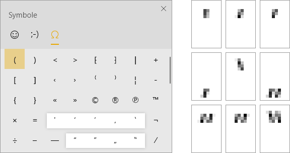
Yes, that’s the actual size on the left
But today I encountered this beauty when I wanted fiddle with the audio balance real quick. Normally I would assume this is coming from one of those deliberately hellish UI threads on Reddit. But no, it’s real:
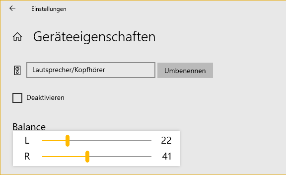
Are you okay, Windows audio settings?