
What a show! Watch all the entries in the results presentation on YouTube. In time, the entries ought to show up on the competition website as well. Thanks and mad respect to Logiker for this Christmas miracle of an event and plowing through hundreds of entries from all around the world!
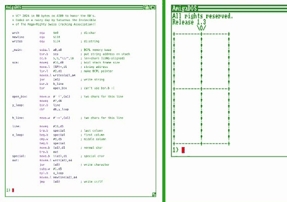
At 64 bytes, my Amiga entry ended up in the 33rd place of the assembly category, if I counted correctly. w00t! The shortest entries came in at 41 bytes on the C128 and Amstrad CPC, respectively.
Edit: 38th place! Still w00t! :)
Also, the overall shortest entry came from Logiker himself with this pretty APL contraption in 34 characters:
⌽11↑'/o\'⋄' -|+'[1+T∘.+2×T←19⍴9↑1]
Anyway, special thanks to Logiker for including a blinking screenshot in the results video. :)
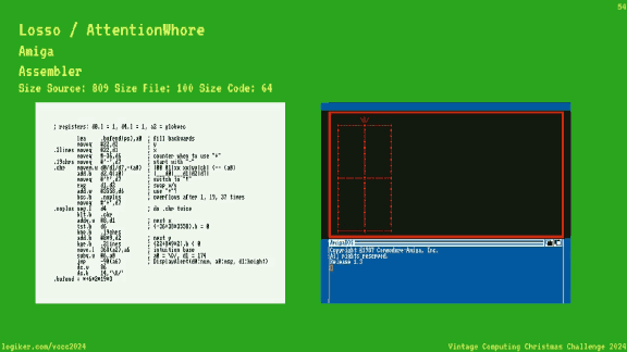
Yes, I’ve used Amiga’s alert function for this entry! :) Here’s a little write-up:
- Geschenkalarm
A thrilling (?) byte shaving journey from 88 to 64 bytes
It was especially nice to see two other Amiga entries in the competition, by Crumb (90 bytes) and Saturnus the Invincible/SCA (80 bytes). The latter is using some clever BCPL shortcuts and stack arranging magic that I’m eager to study. I must refrain myself from typing out the source code in the barely readable 720p video capture, actually. :)
Topaz Unicode is the best thing ever. I’ve praised it before, and I’ve enjoyed using it as my daily driver for all things text ever since.
When writing a post about the German capital ß the other day, I noticed that Topaz Unicode was lacking that very glyph: U+1E9E, “Latin Capital Letter Sharp S”, introduced in Unicode 5.1.0.
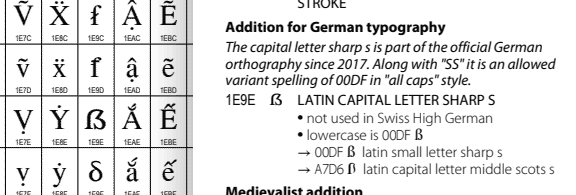
Now the lower-case ß is already a special case in Topaz Unicode, as author Screwtape put extra effort into disambiguating it from the Greek lower-case letter β (beta), boldly abandoning the original pixel glyph and devising a distinctive new look. Großartig!
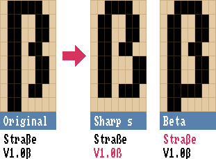
So how would a capital sharp S look in the classic Topaz font? I’ve been studying Luc de Groot’s excellent write-up and design musings about the (then-new) letter, and it turns out… it’s complicated. Even today’s big boy vector typefaces don’t all agree on how a capital ß should look! There are, however, several approaches that work well, as compiled by de Groot in his analysis.
My take-aways:
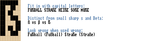
- Make it wide!
- A diagonal stroke helps to differentiate the capital sharp S from the small one
- A hard corner in the upper left can work
- Avoid a ball terminal (like “J” in many serif fonts)
That’s a lot of constraints for 8×8 pixels! Here’s what I came up with, and why:
For one, it’s wider than the small ß (and couldn’t be any wider, really). The hard corner is a bold choice, but I think it fits in nicely when used in capitalized text. And it helps to make it stand out when you use it incorrectly in place of a small sharp s. It would look like a subtle style variant of the lower-case ß otherwise! As for the inward turn in the belly: I don’t see it as a ball-style terminal, but as a reference to the letter’s history as a ligature of ſ and s. It also adds a bit of capital-letter gravitas: Look at me, I’m a big letter and have a fancy extra curl!
Heh, now that’s a lot of words for 8×8 pixels, too!
I’ll issue a pull request for Screwtape’s Topaz Unicode repository, let’s see if my design is a fit.
Update 06-Jan-2025: My suggestion has been accepted, yay!
In the meantime I’ll use my own homebrew Topaz version, as it’s quite easy to generate a custom version with the repo:- Edit src/regular-glyphs.bdf to your liking
- Download the Bits’N’Picas font editor (BitsNPicas.jar), then:
java -jar BitsNPicas.jar edit src/regular-glyphs.bdf- Export as BDF, overwriting regular-glyphs.bdf
- Install some dependencies, in my case:
sudo apt install python3-pipsudo apt install pipxpipx install bdflib
- And finally,
make - Enjoy your freshly baked TrueType fonts!
topaz_unicode_ks13_regular.ttfandtopaz_unicode_ks13_bold.ttf
My contribution to this year’s Teletext advent calendar on Finland’s Yle TV. Again, I am grateful to take part in the project, and again there are tons of great Teletext pieces to explore. Hyvää joulua!

Source code as editor link.
Sich über fehlendes oder falsches Keming, pardon!, Kerning aufzuregen war gestern!
Der neue Shit: Falsch platzierte Versal-Eszetts!
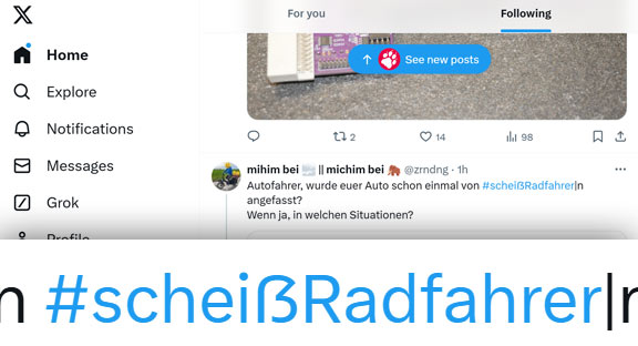
Zumindest vermute ich, dass das jetzt ein Trend ist, weil mir zufällig innerhalb von zwei Tagen gleich zwei Fälle ins Auge gesprungen sind. Einmal auf Twitter:
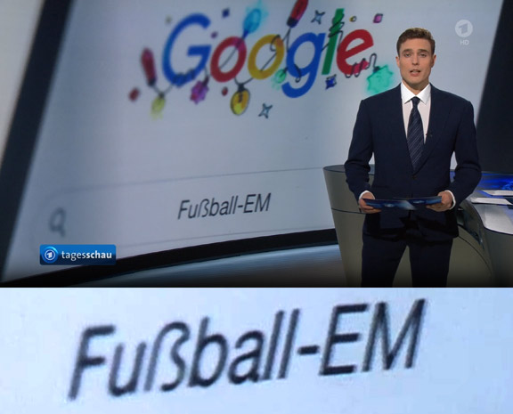
Und einmal bei der Tagesschau, im launigen Werbebeitrag zum Thema Google-Suchtrends:
Dann wieder: Ich habe zufällig gerade von merkwürdigen Ligaturen im Custom Font von Twitter gelesen – hat das vielleicht mit der falschen, öhm, Versalierung des Scheiß-ẞ zu tun?
Und im Fall „Fußball“ vs. „Fuẞball“ bei der Tagesschau sieht es nicht hundertprozentig nach einem Versal-Eszett aus, eher wie eine Ersetzung aus einer komplett anderen Schriftart. Ob man in der Tagesschau-Grafik jetzt auch auf Retro-Fonts ohne Sonderzeichen setzt?
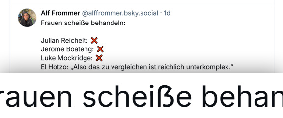
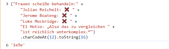
Update: Bluesky has entered the chat.
Oder ein komisches ß in der Schrift? Nein, definitiv ein Versal-Eszett.
My little Worms DC Asset Util is more or less complete now. It can import, edit and export custom levels, mountains, landscapes and teams, complete with previews.
A little knowledge on low-level Amiga tech like blitting, bitmap formats and word alignment sure helped with decoding the last remaining mystery bytes: Oh, these two bytes always contain the bitmap height shifted 6 bits to the left – must be a BLTSIZE expression!
Once the last lingering bugs are squashed, I’ll publish the source somewhere. (It’s already in the page source for now, as an HTML/JavaScript one-filer.) I’ve also put together a documentation page for the various file formats.
Unfortunately this means I now have to continue with the original goal and produce a nice level map, in the hopes that it will be nice enough and in time for inclusion in the upcoming Worms DC 1.5 release end of January. :)
Nice,
the new
Vintage Computing Christmas Challenge (VC³) is on!
This time the challenge isn’t made of festive stars (*) alone, arranged in christmassy patterns,
no, there are six different characters to incorporate!
\O/+-! for the win!
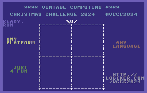
“Wait, what is this?” In short: A reference image in text form is given, and everyone tries to create a program that ouputs that exact image. Any platform, any language – small, weird, exotic, or bombastic. I might have a go at an Amiga assembly entry again, who knows…
If you’re into mind-boggling size optimization and obscure programming environments, why not join the fun? \O/
- Vintage Computing Christmas Challenge 2024
All the rules (and prizes!) - Announcement video
With a little retrospective on earlier competitions.