


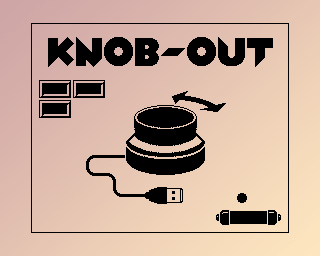

I saw a video of a guy on TikTok walking around a local street food event, highlighting all the food stands not using AI for their menus and logos. Because everyone hates this kind of poster slop by now:
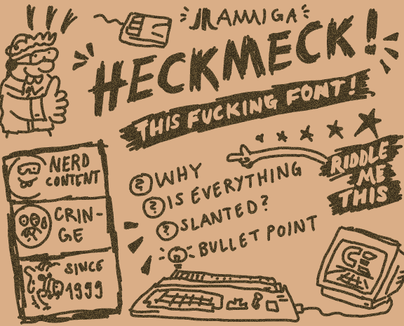
I wondered: Were there many false negatives – AI signage that went unnoticed? Maybe by perfectly imitating the classic amateur layouts, set in Comic Sans and rainbow colors. A funny way to burn your costly tokens! (Prompt: “Make it not look like AI!” – AI: “Sure thing, here’s some WordArt for you!”)
Or the other way around: Are there false positives? Honest, human-made bad designs that just happen to look like machine-made bad designs? Maybe not 100% by accident, but by subconscious priming: You start cobbling together something that feels familiar. Unnoticed, you align your work with all the other designs you’ve seen – but many of those come from the evil slop tools, and yours ends up looking very much alike.
That’s exactly what happened to me thirty years ago!
Here’s a little intro from 1995. Back then, I was an aspiring Amiga coder, but a noob at that.
I had mostly learned assembly from magazines and
source code snippets traded on the schoolyard and by mail. Not e-mail, of course – snail mail,
with contacts we got from
special magazines
full of classifieds for warez computer enthusiasts.
It was lame, but I was proud of my own little routines. I think it wasn’t made all at once for this specific intro, but I do remember it was a really slow process to figure out the Copper list, the screen and font layout in memory, the blitter setup for the scrollers, the blitter setup to draw new letters… you get the idea. Basic stuff, but it was all written by myself!
Yet, no one would believe me – and understandably so. Not because there was any unbelievable code involved, but because it accidentally looked like it was made with the most hated tool of the era: RSI Demomaker!
RSI Demomaker allowed lamers anyone to make demos, like so:
Hard to deny the resemblence. Not only the screen layout – scroll text, main thing, scroll text – but also those damn color strips! What was I thinking?
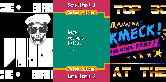
It didn’t matter if I pointed out that my main area was a bit larger, or that RSI Demomaker didn’t support little picture changes like the bullet holes in my intro. “Demomaker! Lame!” was the verdict.
Well, okay. In hindsight, it was less hurtfurl than: “You worked hard for that and it still looks like Demomaker? Lame!” :)
PS: At least nobody questioned the graphics, handmade by my brother. The head might had some assistance from a hand scanner, though. Still digging that font!
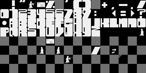
The playback routine and the music were ripped (ProTracker2.2a replay routine by Crayon/Noxious and MADNESS2-PARTC by 4mat, respectively – sorry for mutilating it for the “gunshots”).
Intermission – it’s time for a nerdy, niche, and pointless nitpick again!
Back in Frankfurt, I noticed a detail about the emergency exit signs that has bugged me ever since. It kept nagging in the back of my head…
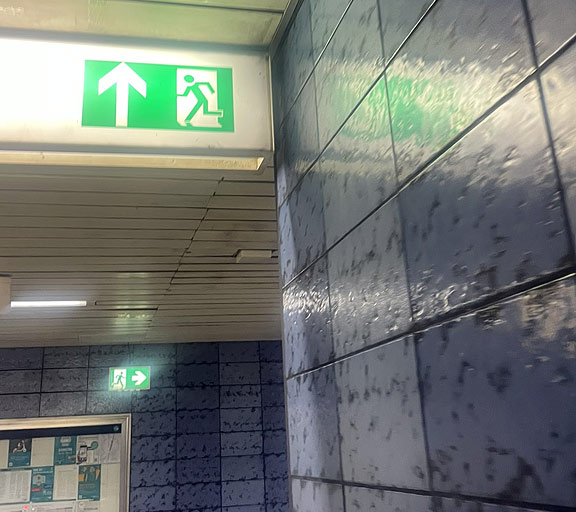
What is the skewed area below the person running through the door meant to represent? I think it’s supposed to be a shadow:
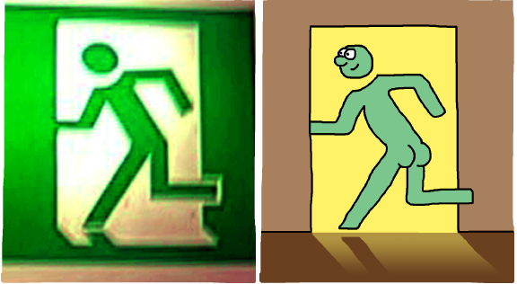
But… how can the shadow of the stretched-out leg have the same angle as the shadow of the door? That’s not how shadows work!
There’s an ISO standard for these kind of signs, and all the renditions for this specific sign (ISO 7010-E001) depict the shadow like that.

Yes, these are icons, not photos. The light source is idealized, emitting perfectly parallel light rays. But even then, or especially then, you would expect this shadow:
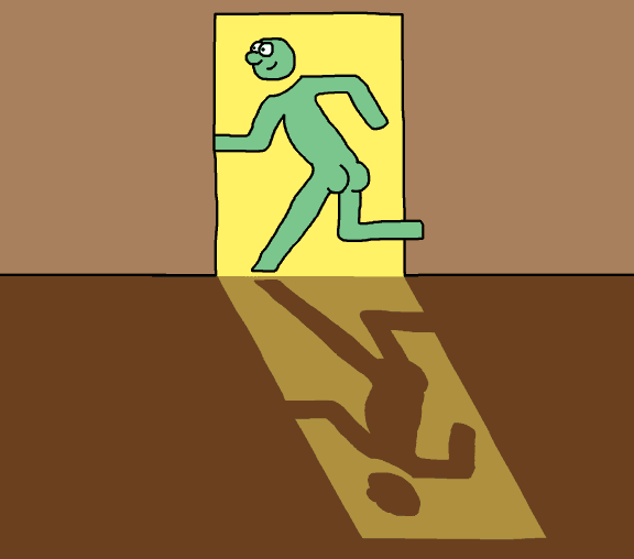
…and not this:
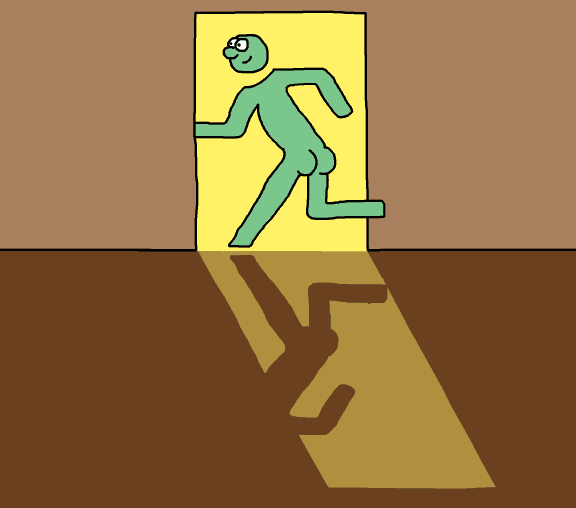
Okay, so the leg shadow cannot be parallel to the door, got it. If we apply this to the original icon and construct a “fixed” version, we get:
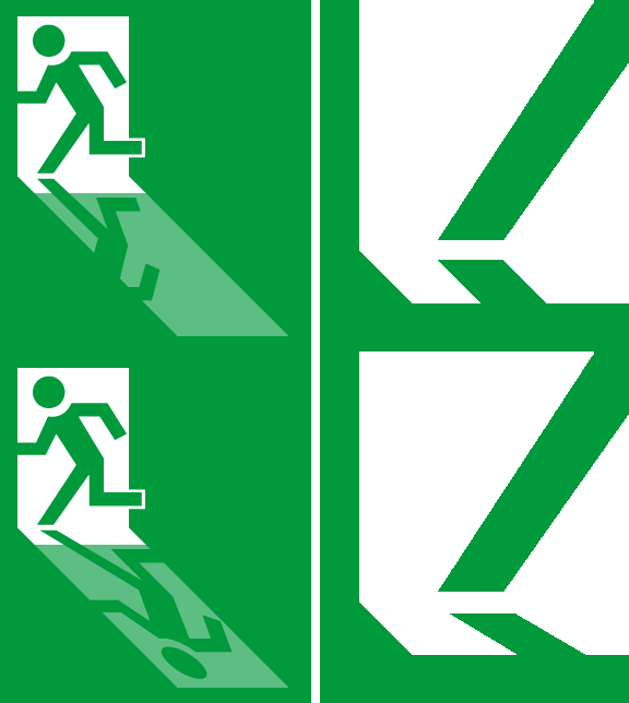
Huzzah! Amazing, and totally worth the trouble.
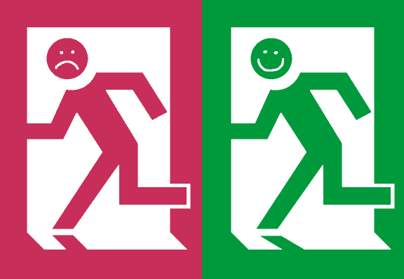
Thanks for following along. :)
I was attending a little tech conference this week (organized by my employer), and I did a presentation about the Amiga Pointer Archive. Preparing that kept me quite busy, and I still had to omit some things, like the media aftermath and the case of the impossible hot spot. Maybe I should spend less time drawing memes by hand for the presentation?
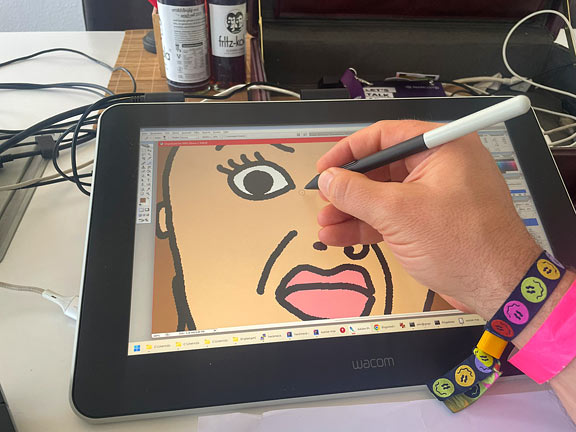
Naw, that’s crazy talk. Look at that cute mouse!
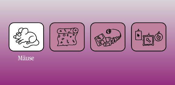
Don’t look at the 1980s wallpaper, though, which seems to be a very special edition where both sides of the paper are printed…
If I get around to it, maybe this time I can double-check all the images for correct attributions so I can post the slides. After all, the memes are hand-drawn already, and I made the important pics myself:
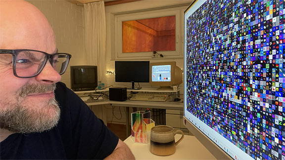
As well as a special prop, the pointer-pointer… :)
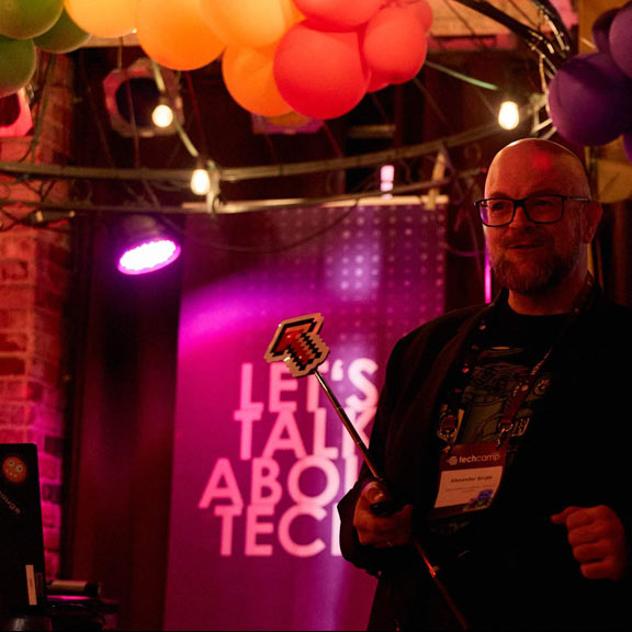
What did I learn from all that for my next talk? Nothing! :)
But I did learn about a cool project by a fellow presenter, and what you can achieve with GBStudio, Photoshop, and a lot of preservence. Check out Pocket Collection by n3rdlich (Instagram has a lot of pics), it’s awesome: real hardware, handmade pixels, zero handmade assembly code if I understood correctly, and a lot of consideration on how to bring a modern user experience to 37-year old retro devices. Great talk, too!
After some legalese back-and-forth among copyright holders, licensers, and licensees that makes you think there’s a multi-billion dollar brand involved (I’m not a lawyer, but it sounds like a good thing, I guess, agreements and all?), a revamped Amiga logo has been revealed. I like it! A lot of careful tweaking and deliberate design decisions, and I do prefer the good old rainbow double-checkmark over the somewhat overused Boing ball.
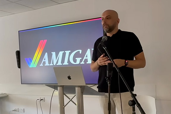
Together with the revamped checkmark, a set of brand colors and an “Amiga gradient” were devised:
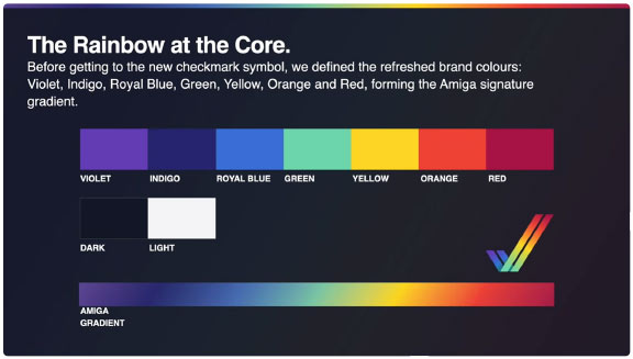
I gotta say… I like these colors! Hmm, yes, I like these colors a lot!
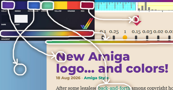
The design team’s got taste! :)
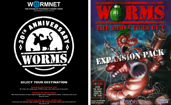
For its 30th anniversary, a very special and universally loved game that brought hours of joy to so many people is celebrating the occasion with a special expansion pack!
No, I’m not talking about the PeeCee lamers. :) This is the real shit, an expansion pack and tons of specials for Worms DC on the Amiga, the original platform where it all started!
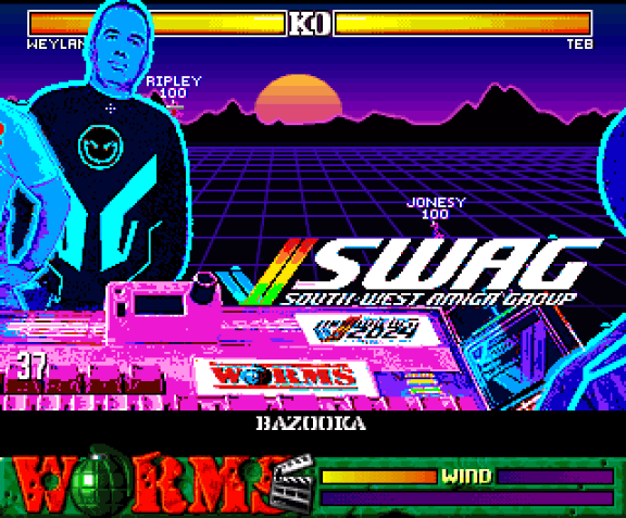
I supplied the synthwave-style mountains for BigD’s “GRAIL” custom landscape – with the “grail” being Andy Davidson’s Amiga 1200, the very machine Worms was created on!
Also, the worm.net homepage has a link to my browser-based Worms asset tool that helped create some of the new custom landscapes. That was a fun little reverse engineering project…
Worms will always have a special place in my heart (see also my Teletext-on-Amiga adaptation Worms VBI), and I’m very glad I could contribute to this project a little. Keep wormin’! :)


