Programming fonts with “clever” ligatures? That’s an “Ugh!” for me.
On Hacker News, I saw a post titled “I tried Gleam for Advent of Code”. Luckily, “Gleam” turned out not to be some AI shit, but a new (-ish) programming language. Interesting! And a post about Advent of Code problems is a great hook to get a first impression and to learn how coding in Gleam looks and feels like.
It is a well-written blog post (thanks!), and I mean no disrepect to the author – but the typeface used for the code snippets made me struggle with the “looks” part already.
How is the code formatted? What operators does it use? What are common idioms? Let’s take a look at the very first block of example code:
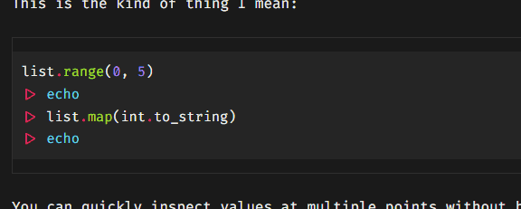
“A-ha, so that’s an example about pipes and the echo command. Is that the complete code or a summary? What are those triangles? Can I click on them and expand more details?”
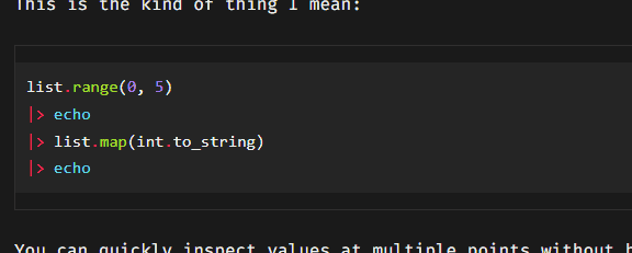
I did click on a triangle and was surprised that it didn’t open up anything (you know, like the <details> element), but instead half of the triangle was selected. “Wait a minute, is this one of those coding ligatures?” Sure enough, after altering the CSS on the page, I could see the actual code:
This is insane. How do you get to know a new programming language when the operators are replaced with arrows, squiggles, and geometric shapes that leave it up to you to guess what they might represent?
| Ligature | Interpretation |
|---|---|
|
Ha, that’s easy! It’s an arrow of course: Or is it? What if it’s an actual arrow, like U+2192 (→), maybe in a string literal? | |
 |
Quick, how would you type this in? |
 |
This must be Could be |
 |
Obviously Or One of those! |
 |
To be fair: I can get behind this one, kind of. It appears when you type |
 |
Then again, things are getting out of hand quickly. Almost like that’s the theme here. There are now so many lines that you want to add a clef and insert some notes. Oh, and is it |
 |
Oh, nice, a postcard! No, wait… This is the concatenating assignment As a Perl veteran, if I were to encounter this abomination in the wild, I would concatenate someone’s face with my fist. |
I’m joking. Use them 1337 ligatures if it makes you happy. But when I have to decode them in an informational article that should be about the exact letters and symbols? Miss me with that!
With regards to coding fonts, here’s my pettiest of pet peeves:
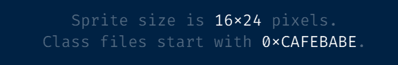
When the underlying text is:
Sprite size is 16x24 pixels. Class files start with 0xCAFEBABE.
Now we’re playing in a Wordpress-like level of cleverness! It’s kinda like the old “smart quotes” feature, together with an attitude straight from good old Clippy:
I see you’re typing
16x24! Surely you meant to use the multiplication sign×, and are just too dumb to type it in properly with your greasy fingers. Don’t worry – we’ll fix it right in the typeface with a ligature hack!We only need one custom rule for every combination:
0x0,0x1,1x0,1x1,1x2… Isn’t that elegant?While we’re at it, let’s also use this for hexadecimal literals!
Wow, thanks Clippy, this is genius! Mind = blown! Pardon me, I meant:

But, um… What about binary numbers like 0b0101? And did you skip the uppercase hex prefix 0X intentionally?
Shut up, nerd!
Okay. Where was I? Right, I wanted to check out that programming language, not rant about glyphs. :)
PS: Shout-out to Matthew Butterick who made the case against this typographical madness six years ago.