


After some legalese back-and-forth among copyright holders, licensers, and licensees that makes you think there’s a multi-billion dollar brand involved (I’m not a lawyer, but it sounds like a good thing, I guess, agreements and all?), a revamped Amiga logo has been revealed. I like it! A lot of careful tweaking and deliberate design decisions, and I do prefer the good old rainbow double-checkmark over the somewhat overused Boing ball.
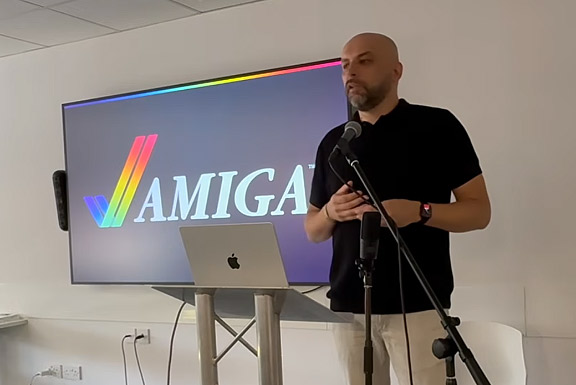
Paweł Dziennik presenting the new logo
Together with the revamped checkmark, a set of brand colors and an “Amiga gradient” were devised:
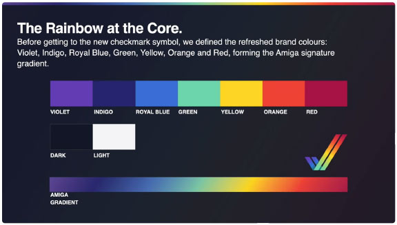
I gotta say… I like these colors! Hmm, yes, I like these colors a lot!
The design team’s got taste! :)


