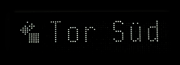
Pixels at the Frankfurt fair – again, but this time they’re neat, not wonky! :)
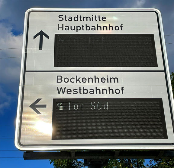
The intricate little logo next to the text caught my attention. Compare it to the “full-size” logo at the fair’s website:
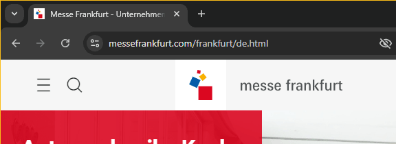
Screenshot: messefrankfurt.com
I love how they put in the effort to include it in the digital sign while boldly adapting it to only 9×11 pixels: