Yuck, what’ this? A ready-made rice-dish sauce with… peaches?
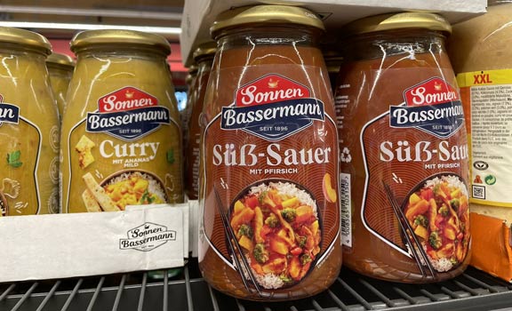
But there’s another “yuck”, something that caught my eye about the “Süß-Sauer” (sweet sour) jar.
Let’s just skip for a moment that by German orthography rules, there is no reason to capitalize the second adjective (Sauer)…
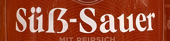
There’s no way this is a regular sharp S – with the straight line going out at the top, it looks more like a capital sharp S! It’s suspiciously wide, too.
If you’re unfamiliar with the aesthetic and historic cosmos surrounding ß and its relatively new uppercase counterpart, I warmly recommend studying Luc(as) de Groot’s excellent write-up. I also rambled a bit about the topic when I designed an 8×8-pixel specimen for Topaz-8.
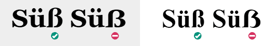
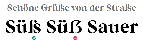
Granted, the difference can be hard to make out – some fonts don’t care too much about the contrast between the lowercase and uppercase variants. With Georgia, for example, smuggling an uppercase ß between lowercase letters doesn’t look very suspicous. Times New Roman does a better job at that, making the odd capitalization stand out more:
Let’s find out what’s happening with the labels in question. Unleashing the power of modern image-based font recognition, the font in question seems to be Bastia by Jen Wagner. Does this font not have a sharp S? That would be very weird. Does it have an uppercase sharp S, and does it look like the one I spotted at the supermarket?

Of course it has an ß character, and a capital version as well. It actually has a very special sharp S design, alluding to the historic origins of the letter as a ligature of ſ and s, back when the printing press was new. After all, this typeface is marketed as a “retro serif”…
So this is not an overcompensation at all – “Our labels are like a headline, should we use that newfangled uppercase ß we see more and more often?” – but rather a case of typographic fumbling. I bet the conversation went like this:
- That typeface looks neat on our packaging, let’s use it!
- Wait a minute, that ß is too extraordinary for my taste… Now what?
- Let’s screw the typeface designer’s choices and just use the uppercase one!
- Perfect! It’s wrong and looks weird, but who gives a shit!
- Not me, that’s for sure! (packaging designers do a high-five)
So, um, congratulations, Sonnen Bassermann design agency, for this… capital crime in packaging typography! :)