This is a little addition to the evolution of the Amiga Topaz font. Surprise! The rabbit hole goes deeper…
Just nine months ago, former Commodore employee Peter Cherna wrote on Hacker News:
I worked at Commodore and was responsible (ish) for the new Topaz for OS 2.0. We had been told to replace Topaz with a sans-serif font, and we replaced it with a font originally called "Clear" that was on one of the Fred Fish disks.
Maybe the font we used was called "Clean", not "Clear".
[…]
"Clean" was the source of the interim font, not of new Topaz.
Edit: Peter Cherna also talked about this at VCF East 2025!
In the same thread, commenter LocalH (who also posted an extracted Topaz 1.4 font on the AmigaLove.com forums in 2021) adds:
The font "Clean" that's part of the NewFonts package on Fish disk 34 is pretty much identical to the font I've seen that was included in 1.4 prototypes.
Interesting! On a closer look, though, there is no font named “clean” in that specific package, neither in the preview picture nor in the disk contents.
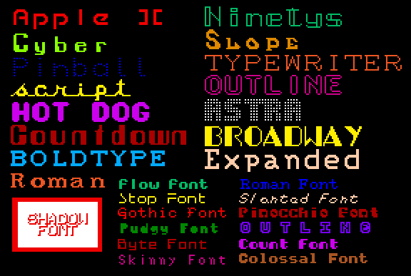
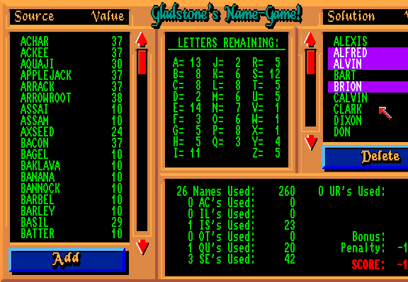
I did however find a clean.font on Fred Fish
disk 256,
used as an asset in a game called “NameGame”. If you look at the
green text, this does look a lot like Topaz 1.4:
It’s hard to tell if this is the original version – was that font specifically created for NameGame and picked up by a Commodore dev? Or has this font has been floating around elsewhere at the time?
There are hints for that:
- DiskMaster2.guide mentions clean.font as a configuration example
- Amiga-Magazin PD 5/93 disk 2 contains an animation program called “CAGS” which comes with clean.font
- Searching for “clean.font” on discmaster.textfiles.com yields 268 results!
Phew! So it’s a mess. There are several incarnations of clean.font, in different sizes and different styles. Apparently a lot of Amiga users thought to themselves: “Let’s chop off those serifs and use it as my clean.font!”
If we look at the preview images provided by discmaster.textfiles.com, we find:
| Specimen | Count |
|---|---|
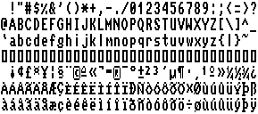 | 84 occurences |
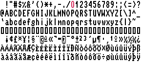 | 64 occurences |
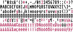 | 21 occurences |
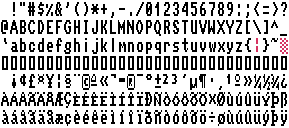 | 31 occurences |
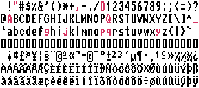 | 2 occurences |
Lovely!
No, really: Aren’t all these variations a charming testament to the creative do-it-yourself spirit of Amiga users back then? “I like a zero without a slash better!” – “How about a super-slim asterisk?” – “That ß isn’t wonky enough!” etc.
If we go with the most popular version, the lineage from Kickstart 1.2 to the interim 1.4 font may look like this:
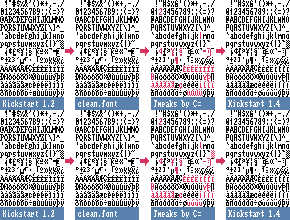
A closing fun fact to this little investigation, coming back to the commentary of Peter Cherna:
As I mentioned, we used Clear, maybe with a few mods (ampersand maybe) […]
Hehe, the ampersand & is one of the few characters that hasn’t been altered in any version of
clean.font – and neither has the weirdest letter of them all. :)
