I’ve been blogging here for roughly a year now, and I love it! It feels nice being a part of the oldschool web, especially with so many social media sites going to shit.
To celebrate, I refactored the overall design a bit, and freshened up on web stuff. CSS grids are nice and weird at the same time – you can specify your rows and columns using ASCII art (nice), but the elements are also decoupled from the markup order (weird). Of course I also ran into some browser edge cases in the process*. At least that’s still the same as it was thirty years ago, when I started learning HTML on the Amiga! :)
body {
	grid-template:
	". hd hd ." 88px
	". r1 r1 ." 8px
	". ts ts ." min-content
	". r2 r2 ." 8px
	". mn sd ." auto
	". ft ft ." 36px
	/ auto 640px 320px auto;
}
*) The edge case in question:
When making the browser window really narrow, the desktop versions of Chrome and Firefox
trigger the overflow:auto behavior of <pre> elements too late,
as if they’re ignoring the right margin of the parent element. This only happens when the body’s layout
is display:grid. Luckily, the margins look okay on mobile (and, strangely, also in Chrome
when simulating smaller devices in the developer console).
I really don’t have a target audience in mind, I just write stuff that I would enjoy reading myself. Of course it’s awesome seeing my post making the rounds in forums, getting upvotes on Two Stop Bits, being featured on amiga-news.de or Hackaday, getting showcased on Twitch, being invited to a video podcast, and receiving personal feedback. Shortly after I started with all the new content a year ago, Grip of datagubbe.se sent me a cordial message of appreciation, and coming from someone who also curates a lovely share of real estate in the oldschool web, that made my day back then!
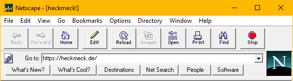
In the oldschool web spirit of “What’s Cool?”, below are some post and projects from the last year that you might enjoy.
- strss
Relaxing soundspheres in 512 bytes - Bringdienst für Altphilologen
(German) Humanistischer Quatsch: Wie dekliniert man „lieferando“? - Modding the Amiga boot hand
A custom Kickstart ROM with style - Worms VBI
Worms in Teletext… on the Amiga! - Coppenheimer
Real-time memory inspection for the Amiga - Knob-Out
Play Breakout with your volume control - Musique non stop
My favorite Teletext piece of 2024 - Decrypting the Revision logo
What’s in the Revision logo? Answer: nothing :) - Amiga Topaz 1.4
A nerdy journey in typographic archaeology - new art
A quirky Amiga demo in 3D - Geschenkalarm
Sizecoding alert! - Sherlock Horse
I love that guy! (Also in Teletext)