Topaz Unicode is the best thing ever. I’ve praised it before, and I’ve enjoyed using it as my daily driver for all things text ever since.
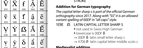
When writing a post about the German capital ß the other day, I noticed that Topaz Unicode was lacking that very glyph: U+1E9E, “Latin Capital Letter Sharp S”, introduced in Unicode 5.1.0.

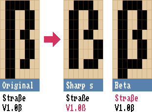
Now the lower-case ß is already a special case in Topaz Unicode, as author Screwtape put extra effort into disambiguating it from the Greek lower-case letter β (beta), boldly abandoning the original pixel glyph and devising a distinctive new look. Großartig!

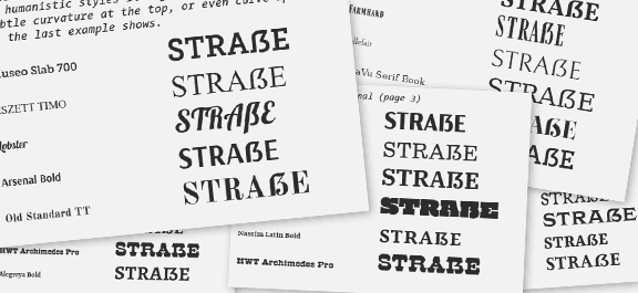
So how would a capital sharp S look in the classic Topaz font? I’ve been studying Luc de Groot’s excellent write-up and design musings about the (then-new) letter, and it turns out… it’s complicated. Even today’s big boy vector typefaces don’t all agree on how a capital ß should look! There are, however, several approaches that work well, as compiled by de Groot in his analysis.

My take-aways:
- Make it wide!
- A diagonal stroke helps to differentiate the capital sharp S from the small one
- A hard corner in the upper left can work
- Avoid a ball terminal (like “J” in many serif fonts)
That’s a lot of constraints for 8×8 pixels! Here’s what I came up with, and why:

For one, it’s wider than the small ß (and couldn’t be any wider, really). The hard corner is a bold choice, but I think it fits in nicely when used in capitalized text. And it helps to make it stand out when you use it incorrectly in place of a small sharp s. It would look like a subtle style variant of the lower-case ß otherwise! As for the inward turn in the belly: I don’t see it as a ball-style terminal, but as a reference to the letter’s history as a ligature of ſ and s. It also adds a bit of capital-letter gravitas: Look at me, I’m a big letter and have a fancy extra curl!
Heh, now that’s a lot of words for 8×8 pixels, too!
I’ll issue a pull request for Screwtape’s Topaz Unicode repository, let’s see if my design is a fit.
Update 06-Jan-2025: My suggestion has been accepted, yay!
In the meantime I’ll use my own homebrew Topaz version, as it’s quite easy to generate a custom version with the repo:- Edit src/regular-glyphs.bdf to your liking
- Download the Bits’N’Picas font editor (BitsNPicas.jar), then:
java -jar BitsNPicas.jar edit src/regular-glyphs.bdf- Export as BDF, overwriting regular-glyphs.bdf
- Install some dependencies, in my case:
sudo apt install python3-pipsudo apt install pipxpipx install bdflib
- And finally,
make - Enjoy your freshly baked TrueType fonts!
topaz_unicode_ks13_regular.ttfandtopaz_unicode_ks13_bold.ttf
