Worms VBI
Teletext, Worms, Amiga – what?
Worms VBI is a game released at the Evoke 2023 demoparty (where it won the interactive/game competition). It runs on an Amiga 1200 computer that generates a video signal containing Teletext data which, in turn, is displayed on a Teletext-capable TV. While running, a single Teletext page is being updated 25 times per second, making an action game like this possible.
The title is a play on the many existing “Worms” editions, but here, “VBI” stands for Vertical Blanking Interval, because that’s where the Teletext signal lives – and so do our Teletext worms!
For a quick introduction, watch the original YouTube presentation.
Update: Worms VBI has been nominated for the 2024 Meteoriks awards. To celebrate, I recorded a new gameplay video (direct link).
Also on YouTube, there’s another nice recording which also shows you a bit of the setup, check out Saberman’s gameplay video (cheers!).

Worms VBI combines three things:
- Graphics, gameplay logic and sound effects for a Teletext adaption (re-imagination?) of the original 1995 game Worms.
- The technical solution for outputting Teletext signals directly from an Amiga – a
world’s first! – Update Dec 2023: Apparently, this has been done way back in the 1990s! Read about the the real world’s first! - An implementation of the game in assembly language.
The technical details of Teletext output on the Amiga are a topic in itself. Here, we’ll look at the Teletext implementation.
First steps
When the breakthrough of outputting Teletext on the Amiga was achieved in May 2023, I wanted to build something to showcase the new possibilities.
Why Worms?
- It is one of the most well-known and most successful Amiga games ever, laying the foundation for a whole franchise of “Worms” games on all kinds of platforms.
- In 2019, there was a hilarious post on the Team17 website (published on April 1st) about the history and details of an alleged Teletext version of Worms, featuring some great mockup graphics by UK-based Teletext artist Horsenburger.
Loved by the Amiga and the Teletext community – a no-brainer!

Also, the prospect of bringing an April fool’s joke to life, for real, was both silly and captivating, and therefore right up my alley!
Planning the graphics and everything
Porting Worms to Teletext introduces some limitations compared to the original game, as can be seen when comparing Horsenburger’s designs with the real thing:
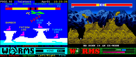
Specifically:
- We are limited to the 8 Teletext colors:

- A Teletext page is only 40×24 characters (or cells).
- Teletext uses mosaic characters for graphics: Instead of letters, a grid of 2×3 on/off rectangles can be displayed per cell (this is why the pixels are
called sixels in Teletext lingo):
 etc.
etc. - Using these mosaic characters, the total Teletext display area is still tiny. We have a resolution of 78×69 instead of 320×256.
- Each letter/mosaic block can have only one foreground and one background color.
- To make matters worse, we cannot freely assign foreground and background colors: Each color switch and background color switch “eats up” one cell, leaving a hole in the graphics where we cannot display anything else.
For more technical details, see the “420 Years of Teletext” write-up at GitHub.
With that in mind, I set some constraints and goals:
- The game display would be drawn in layers of different colors, back to front: background, land, worms and weapons.
- While some characters, i.e. blocks of 2×3 pixels will occasionally be lost because of color changes (displaying a black cell), this is okay since everything is moving at a high frame rate.
- The foreground layers (worms and land) will be drawn at the character resolution (40×24) – while the worms and land shapes can be drawn with more detail within their mosaic cells, they can only be positioned in whole cell steps (2 sixels horizontally, 3 sixels vertically).
- Still, I wanted to have some eye candy: Parallax scrolling against the background and animated water, for example.
- Maximize the game viewport: Use the 32 available characters in the top row (where the station ID and clock is usually shown by broadcasters) for scrolling status messages, and have only one line of weapon/wind info at the bottom.
- Display worm name and health points only for the active worm, and only until it starts moving.
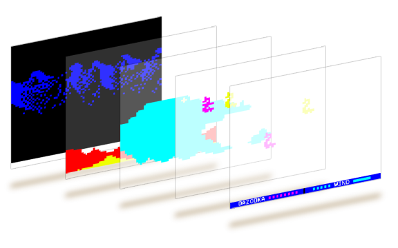
And overall, try to stay true to the original game play and character…
Background
The background can move at sixel-precision, creating a nice parallax effect with the faster-moving foreground.
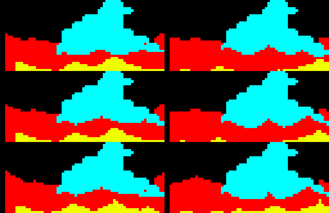
Technically, there are six copies of the background graphics being used: One for each possible sixel alignment – 0 or 1 sixel to the left, and 0, 1 or 2 sixels down (since the background graphic itself can only be positioned at character/cell precision).

Land
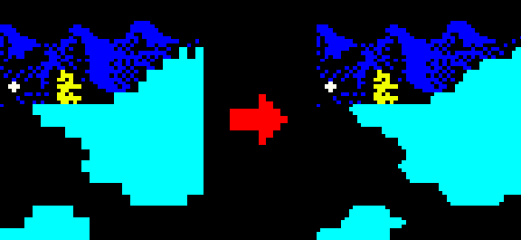
The land is either present or absent for each cell (solid or not), but this would lock blocky when rendered as filled or empty 2×3 cells, even for Teletext standards.
Instead, single sixels are cut off at the edges, giving a somewhat rounded look. Most importantly, this looks good enough™ and is easy to implement.
Water
The original Worms game used five layers of animated water stripes, moving in a parallax effect (layers in the back moving slower than in the front). I wanted to have something like this in Teletext, too!

I drew up a water animation with the original water graphics as reference, then doubled the number of frames from 8 to 16 for extra smoothness (by eye-balling the new in-between frames). Horizontally, the water tiles would repeat every 128 pixels.
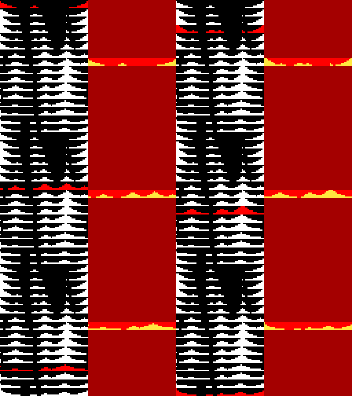
Putting five layers of water into the Teletext game screen seemed a little much for the target resolution, so I started with three layers. Each layer takes up two rows of characters/cells:
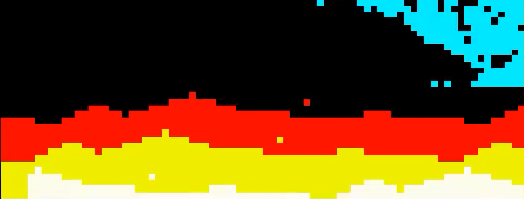
This caused headaches with the color transitions when the water levels touched the land, requiring a lot of graphical gaps for color changes. After some experimentation the final water layers were designed like this:
- A layer of red-on-black water in the background.
- An invisible water layer: The land is drawn on a red background, and where the water touches the land, the water sixels are subtracted from the landscape (see below).
- A foreground layer of yellow-on-red water in the foreground.
Because of the way Teletext control characters work, we lose two cells for graphics at the start of the lines that use a red background, but given how nice the final effect looks, this seemed like a good compromise. (We need a control character to set the background color to the foreground color, and then another control character to set the foreground color we want to use in front of it.)
Worm sprites
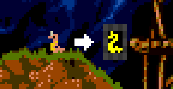
In the beginning, there was “Worm Zero” – the base worm sprite. When I studied the original Worms graphics, it quickly became clear that this would work best with a size of 3×3 characters (corresponding to 6×9 sixels):
Then I noticed the original worm sprites adapt to the shape of the landscape, so even though our landscape would only have the granularity of whole characters (2×3 sixels), we still need different standing positions, depending on whether the worm
- stands flat,
- stands flat with a free cell for a dangling tail,
- stands on an upward-facing slope,
- stands on a downward-facing slope, or
- stands in a tight spot with only 2 cells to stand in.
These are the base worms in their different positions:

When moving sideways, the worm can transition from one standing position to another (e.g. from “standing flat” to “stand on downward-slope”, etc.), so we would need a little worm-crawl animation for all the combinations. I went for three animation frames – two frames seemed too few, more than three were too much work. Look at them go:

Later, once the worms were happily crawling around the landscape, additional frames were needed for the main weapon, the bazooka. The bazooka, in turn, could face straight ahead, upwards, or downwards:
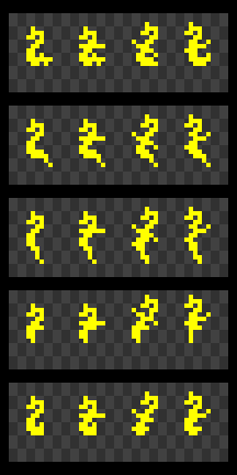
Some of those sprites look a little wonky. It is not easy to add a diagonal line to an already tiny worm sprite! I had to have Mr. Wormy stretch himself here and there, so you can distinctly make out the bazooka, but later in the game, this looked much better than pixel mush.
Together with animation frames for jumping, tumbling, the suicide sequence, the “hell-loo?” nod, explosions, and the “active player” arrow, this was already quite a sprite sheet:
Internally, the sprite sheet is almost double the size of this, since mirrored versions of each worm sprite are used when the worm is facing right.
Bazooka sprites
Apropos bazooka: While the initial game prototype simply used an “X” character for the bullets fired by the bazooka, I tought that more precise-looking bullets would be worth the effort. After all, the bullet physics are calculated in sixel-precision already, anyway. So why not display the bullets sixel-perfect?
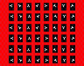
Sprite-wise, this meant two things:
- Have a bullet version for all eight base directions (left, left-up, up, etc.), and
- have six versions of each bullet sprite (shifted 0 or 1 sixels to the right, shifted 0, 1, or 2 sixels down).
This requires 36 images in the sprite sheet:
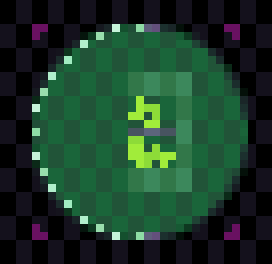
The bazooka crosshair for aiming received special handling as well. There are 17 possible aiming positions in each direction (one facing straight, 8 going up and 8 going down):
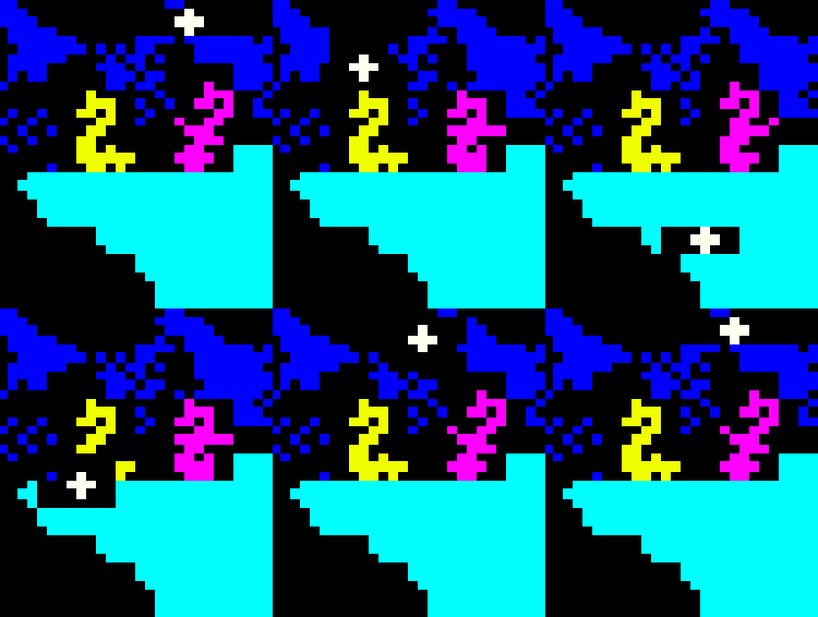
When plotting the crosshairs (a 3×3 sixel cross) into the game display buffer, things often looked rather ugly:
- A color change character is needed before and after the crosshair.
- Since the crosshairs are not aligned with characters/cells, that tiny crosshair can eat up 2 rows and 4 columns, depending on its exact position.
Especially when the crosshair touched an area of the landscape, the display could get confusing (and ugly).
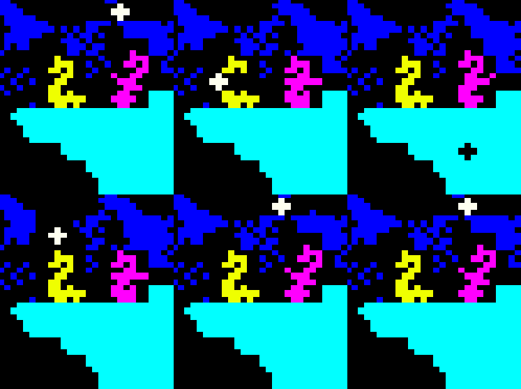
As a compromise, I added a special case for drawing the crosshairs over solid blocks of the game map: Instead of drawing a white-on-black cross, the crosshair sixels are subtracted from the existing landscape, and thus require no ugly black cells for color switchng. While tedious, it instantly looked much better:
Additional graphics
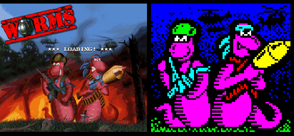
To round things off, the game needed a title screen as well (also used as the menu screen), so I made a Teletext version of the original title graphics. At this point, I had been avoiding looking at the April fool’s post or Horsenburger’s Teletext mockups for several weeks, in order not to be influenced too much by it.
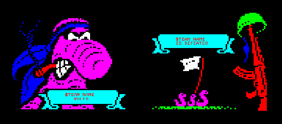
And finally, two game over screens:
Sound
At this point, I was already feeling on the fringe of, well, infringment a little bit (of the original and still-current, copyrighted Worms IP), so music and sound-wise I thought it was best to create as much original content as possible here as well.
AttentionWhore team mates Green and bod delivered! A whimsical worm sample soundbank, true to the original Worms spirit (Green), and a fantastic battlefield-themed atmo sample for the title screen (bod). Unfortunately, you cannot hear them too well in the original YouTube presentation, so here are some of them:
Physics
“Physics” might be a bit of a stretch, but the game needed to have at least a rough version of:
- Wind
- Worm physics (jumping, falling, being blown away by explosions)
- Bazooka missile physics (movement, gravity, collisions with worms or land)
Proper physics are hard, so I took shortcuts where I could. The wind, for example, behaves weirdly, and a bazooka missile might fly through a patch of land if it is fast enough (there are no in-between collision detection steps when updating the missile position). Damage points and push-away forces are applied using simple tables relative to the center of the explosion.
But at least you can fire at other worms or drop a dynamite stick next to them and nothing too unexpected happens. I would say it comes out at 60% expected physical behavior and 100% fun, so this, too, reaches the good enough™ mark. :)
Housekeeping
Boring and tedious, but still important:
- Camera movement (center on player or missile, otherwise mouse-controlled)
- Player time countdown
- Trigger “hello-oh” animation and sound after some seconds of inactivity
- Manage special animation sequences (tumbling, dying, falling, health points losses)
- Player movement aftermath: subtract damage points, self-destruct when health is zero, collect new damage points and push-away forces caused by that explosion, repeat
- Select new player, check “is one team already dead?”
This is where I realized the project was slowly turning into a real game: “Cool, I’m battling with nerve-wrecking housekeeping tasks now!”
Fun surprise when putting in the default player names: The original game already contained “bod” as one of the worm names! Sadly, no “Losso”… :)
Programming the game… twice
The prototype was coded in Kotlin, as I already had a set of tools for Teletext processing lying around from 420 Years of Teletext. Once the basic stuff was looking good enough, I started porting everything to the Amiga in 68000 assembly language. A week before the deadline, the Amiga code base had overtaken the prototype game, in that it had more features than the prototype. Because of that, there is no Kotlin version of the final game that you could play locally without an Amiga and a TV.

The Amiga version includes a primitive Teletext emulation without colors that is shown in parallel to the Teletext data feed in the vertical blank interval:

This way, you have some idea what is going on even without Teletext, and I needed this for debugging anyway.
Currently (Aug 2023), I’m thinking of a way to make this game playable in the browser, and it will be an epic Rube Goldberg machine contraption, if it works. (Idea: Emulate the Amiga in the browser using vAmiga like, for example, the Flashtro folks are doing it, and then add an extra hack on the Amiga side and in the browser to feed the Teletext data into a browser-based Teletext emulation of ZXGuesser’s making.)
Either that, or bite the bullet and add a proper Teletext emulation with colors. This way, all Amiga users play could the game even without connecting a Teletext-capable TV. On the other hand, I find it a nice touch that you have to go through the hassle of connecting a real Teletext receiver before you are rewarded with the proper game graphics.
Releases
I’m planning some mild updates to the game that didn’t make it into the original release because of time constraints:
- Fix bugs (obviously; the party release has only been really tested on my Amiga 1200/060)
- Should eventually work on Amiga 500+, Amiga 600, Amiga 3000, Amiga 4000 (needs testing and optimizing; A500+, for example, is too slow at the moment)
- More than one terrain map (or even generate them dynamically)
- Gather some player stats during the game (like in the original game)
- Insert more sound effects (boring, traitor, etc.)
- Attract mode (i.e. the game playing by itself when waiting for players to start a new game; I had used a simple “smash random keys” simulation in a debug session once, and it was entertaining to watch)
So, nothing too wild. I’m proud of how complete and playable the game has already become in a time span of only two months, from silly idea to completion!
Thanks to the helpful crowd over at the English Amiga Board, a first bugfix release is available (see below). A particulary nasty bug was found in my cooperative multitasking hack, and I had overlooked some “read word from odd address” accesses because the 68060 I was testing with allows that. Big thanks to everyone at EAB, and special thanks for the TV/Teletext testing you did so far!
- Party version
- worms-vbi-partyversion.exe
- Do not use, will crash sooner or later!
- Fix 01
- worms-vbi-fix-01.exe / worms-vbi-fix-01.adf
- Nasty random bug in task switcher fixed
- Some word-at-odd-address reads fixed
- Start game with space (F2 to go through the intro sequence used in the presentation video, if you’re into that)
- Also use Return, left Shift, left Alt for jumping
Note: You can exit the game any time by pressing both mouse buttons.


