
![]() Cool stuff to stumble upon, new and old.
Cool stuff to stumble upon, new and old.
What’s Cool? ·
II ·
III ·
IV ·
V ·
VI ·
VII ·
VIII ·
IX ·
X
- AmigaOS 2: The Greatest Upgrade
In the beginning, the Amiga gods created the classic GUI. The gods said “let there be blue,” and the blue was good. That was all nice and well, and I really dig the efforts to stay oldschool and keep modernizing the old look at the same time. But it’s also true that the fancy, professional-looking 3D update to the Amiga UI was really exciting at the time. Before we even got the update at home (by acquiring an Amiga 1200), I spent a lot of time designing application mockups (see here and here) out of sheer excitement. And that was only the visual part – the datagubbe post discusses a lot of the improvements under the hood as well. - How to start writing a music replayer for your demo in <200 lines
I don’t know if I will ever write a Windows demo (again *cough*), but it can’t hurt to keep up with the basics in Microsoft-land, either. Together with Gargaj’s demo writing mini tutorial referenced in the very first What’s Cool? post, this is a great starting point for dummies like me. - Der PET und die Demoszene
(German) Bodo und Krill wurden vom „Besser Wissen“-Podcast eingeladen, über den PET und die Demoszene zu quackeln. Natürlich auch über C64, Hardware, Demopartys und den kreativen Prozess. Reinhör-Empfehlung! - Building an AmigaOS Development Environment in 2026
Because why not? I remember when Hannibal’s WinUAE demo toolchain was all the rage in 2012 (because it was great, and at least for me, it was released just at the right time – thanks, Han!). Nowadays, there are a million more ways to conveniently build Amiga software, and that’s great. This one is built on gcc and Amiberry and even sports a gdb server on the Amiga side – cool stuff! - BoingKick
A boot screen replacement reminiscent of my own hack, but specifically for the Amiga 1000. This one also patches the “strap” module that is normally responsible for showing the boot prompt, i. e. the weird hand holding a Workbench disk. Instead of merely showing an alternative boot prompt picture, BoingKick also procedurally creates a Boing ball and animates it with palette cycling. Sweet!
“Why are you upset, honey?”
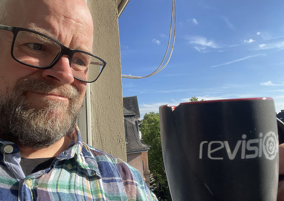
“It’s just a mug…” :(
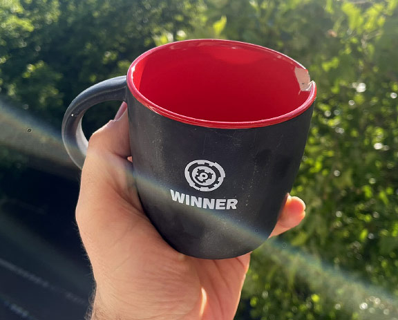
Of course, I’m not really upset! Well, not upset-upset; ignore the teeth-grinding noises. I try to move on, and accept that out of a hundred cups that we own this is the one that takes a dent.
Also, it’s not that there wasn’t a way to replace this mug with a new one in the future – even if it’s the distant future! :)
PS: Since I’m on vacation and don’t post a lot: Here is where I got that mug…
Four years ago, I was toying around with Teletext rendering prototypes for an Amiga demo. Those prototypes quickly turned into a demo in its own right, and I put aside the original goal of doing this on the Amiga.
That demo became 420 Years of Teletext.
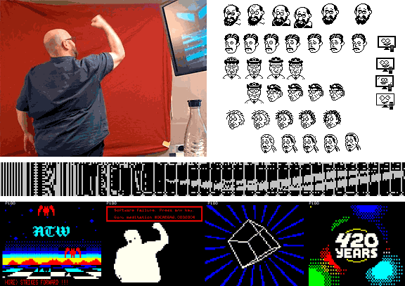
Teletext output on the Amiga took another year to crack. It then turned out it wasn’t a “world’s first” achievement after all, but fun was had all around!
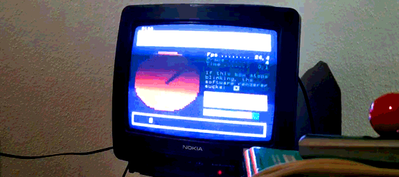
Back then, it was only a month before the party (Evoke 2022) when we had proof: This can actually work! The demo was already half done when Green hooked up the trusty Nokia TV of his youth, and it ran some effects in 25 fps. I only had a stupid smart TV myself, and the software-based Teletext rendering in those devices cops out at seven frames per second. Lame!
At the party place, we recorded the thing hours before the deadline with Ghost’s mobile phone in a dark orga room, and this has been the only proper recording of the demo ever since.
Until now! A higher-resolution version is on YouTube, too. Enjoy and learn all about Teletext’s history! :)